A Slab Design System
Building and scaling a design system
Increasing design & engineering efficiency and leveling up the visual design at Acelab.
Role
Product Designer
Employer
Acelab
Areas
Design System, Component Building
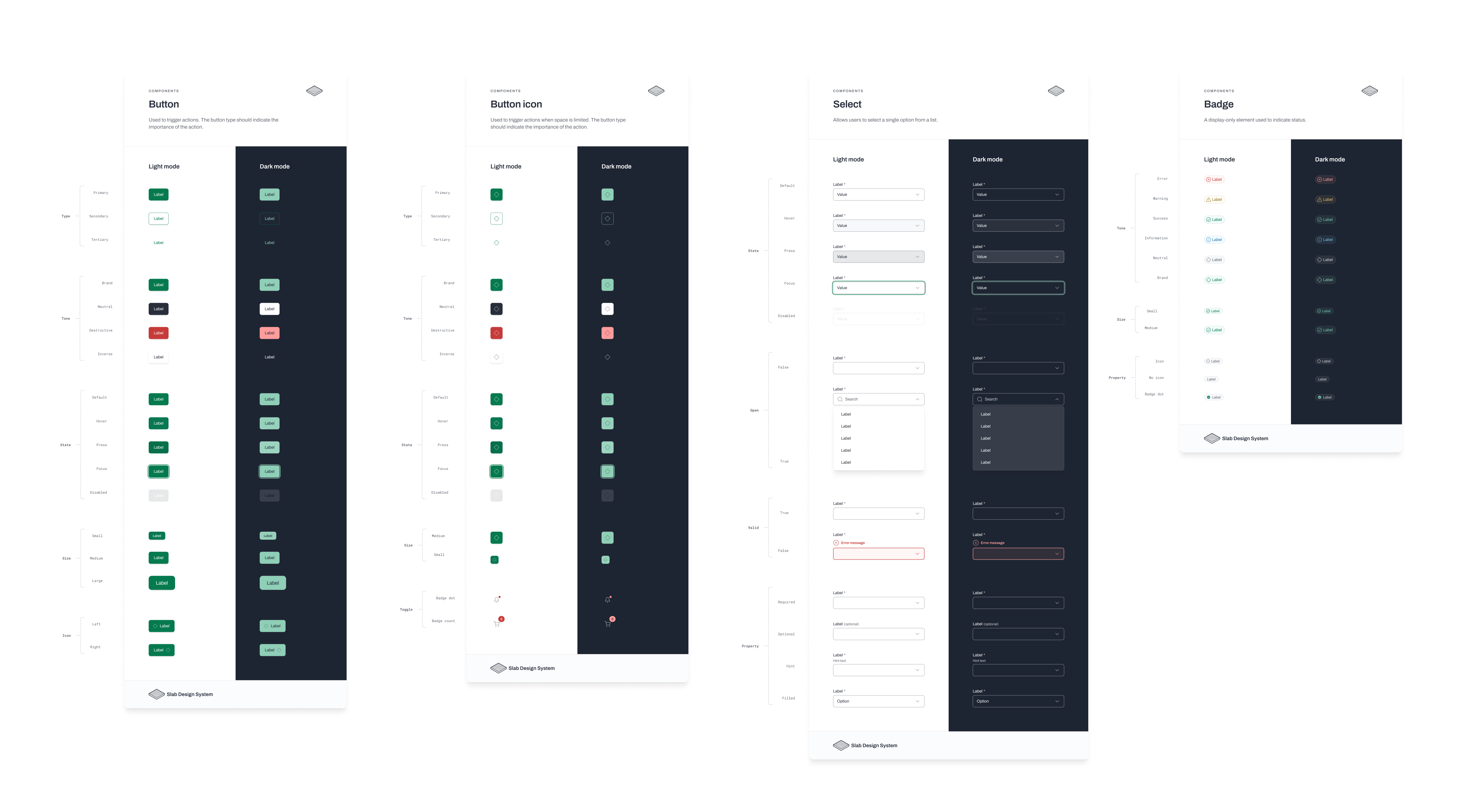
Building a Robust Design System at Acelab
When I started at Acelab, the existing design system was minimal—essentially branding guidelines with basic button styles. As the application grew more complex, inconsistencies emerged, even within the limited design system in place. Recognizing the need for a more comprehensive approach, I advocated for the development of a robust design system to address these challenges and promote greater adherence to design standards.
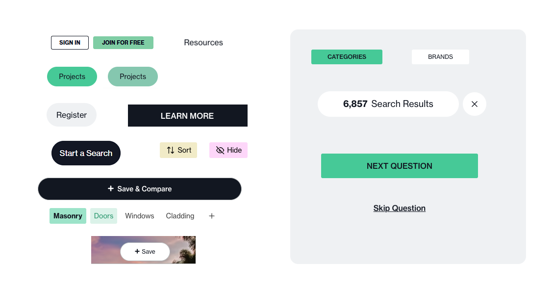
The variety of action buttons currently on the platform
Researching a variety of options
Evaluating Options for the Design System
To determine the best path forward, I considered a variety of prebuilt design systems as well as the possibility of developing our own from scratch. My criteria included:
After extensive research, I identified that many of the well-known design systems were either too complex for our needs or lacked adaptable Figma files. Additionally, our engineering team expressed a preference against using prebuilt components, which narrowed my focus to design systems with strong foundational Figma assets.
I ultimately chose to build upon the design system provided by Practical UI.
Educating and Collaborating with Engineering
To ensure successful implementation, I started by educating our engineering team about the benefits of a robust design system.
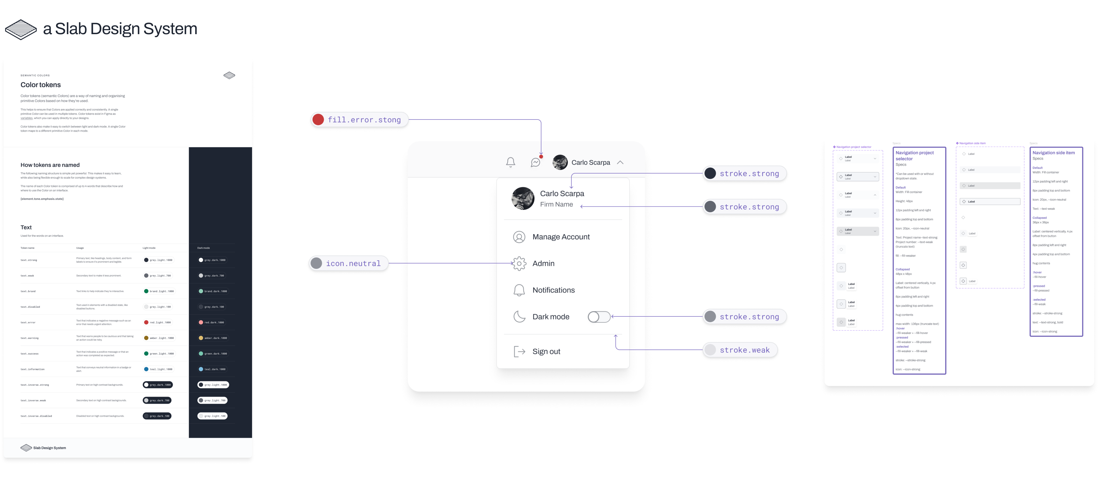
Design Tokens Given our tech stack—Vue, Tailwind, and CSS—I exported Figma variables to JSON and demonstrated their practical use cases.
Educaction I also shared relevant blogs and resources to highlight the advantages of a token-based system, such as this series of articles by Michael Mang on integrating design tokens with Tailwind.
Collaborative Rollout We began rolling out components incrementally, transitioning to the new design system while addressing gaps and ensuring alignment between design and engineering.
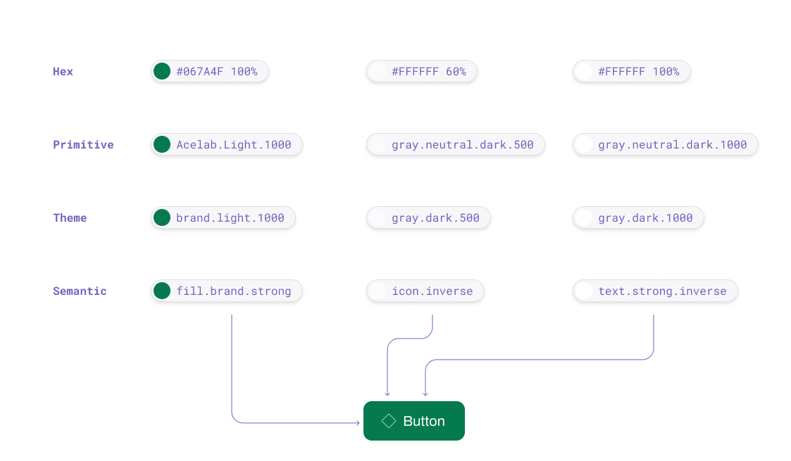
Design token architecture
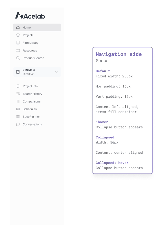
Side navigation component in action
Customizing and Creating New Components
Aside from implementing our basic fonts and colors, I also embarked on creating some components that were unique to our platform. For example, making some enhancements to the Side Navigation and adding some additional functionality like dropdowns and selectors.
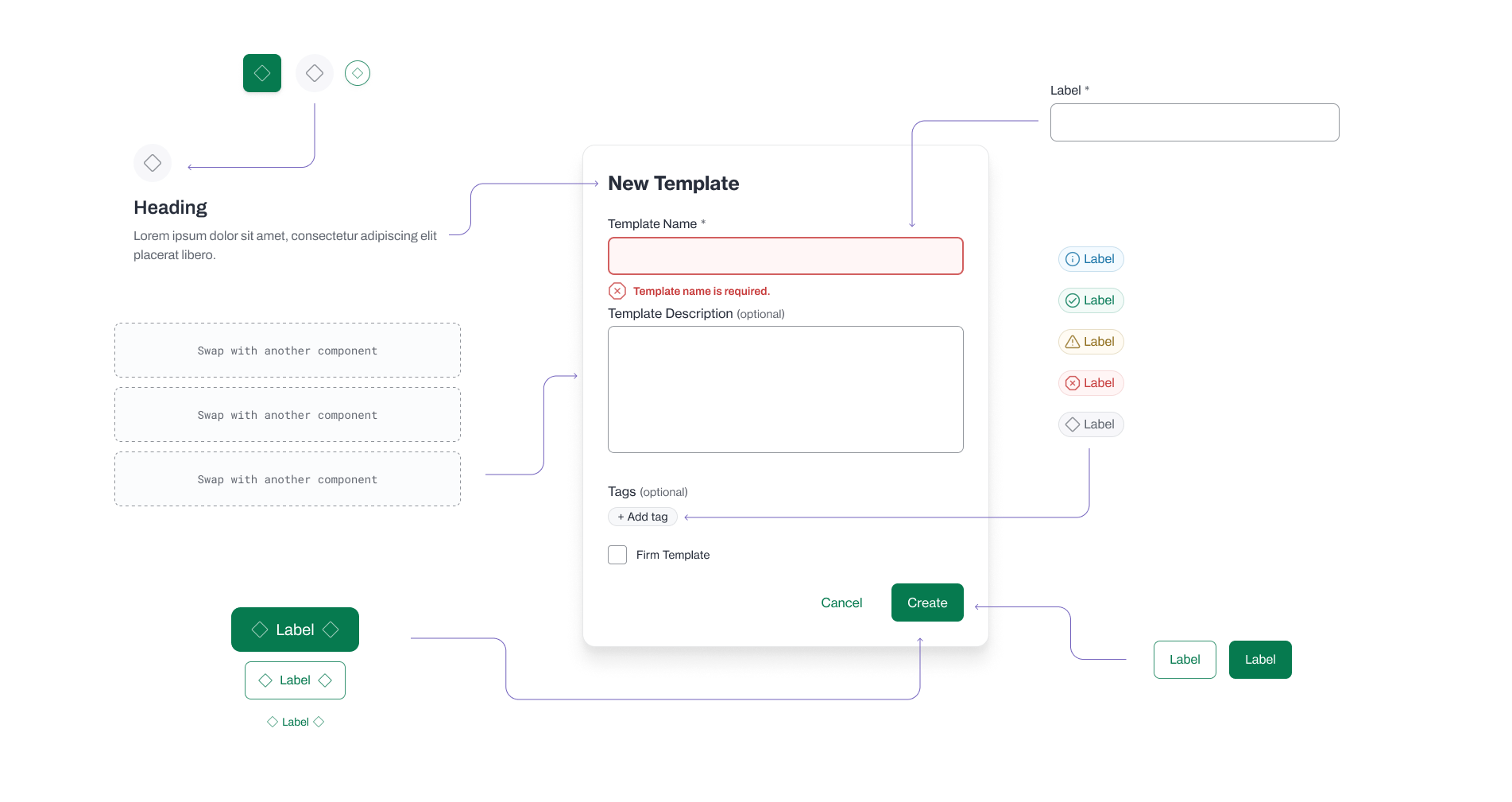
Atomic components combined into a Modal
Early Results and Progress
While the full implementation of the design system is ongoing, we have already seen significant improvements:
- Consistency: Components across the application are becoming more uniform.
- Efficiency: Communication between design and engineering has become more streamlined, reducing time spent clarifying standards.
- Scalability: The system is equipped to handle our growing application needs with minimal additional effort.
Reflection
The process of establishing a robust design system has been transformative for Acelab. By aligning design and engineering through a shared framework, we are not only improving the quality of our product but also fostering a more collaborative and efficient workflow. This initiative underscores my commitment to creating scalable, user-centered design solutions that drive organizational success.