Acelab
I redesigned Acelab's navigation to match how architects actually work.
Role
Lead UX Designer · ~3 months · Launch late 2024
Employer
Acelab
Focus areas
UX/UI, Navigation, Research
Team scope
Led navigation redesign; collaborated with product, engineering, and internal stakeholders. Validated with power users and architects.
Context
When I joined Acelab, my mandate was simple: "Update the UI." Within weeks, I'd identified a deeper problem: the navigation architecture hadn't scaled with the product. Users couldn't find features. Internal teams didn't know certain tools existed. I pitched, and shipped, a complete navigation overhaul that helped establish product-market fit, contributing to Acelab's $13.5M Series A funding.
The Problem: Navigation Had Never Scaled
Through platform audits and internal interviews, I identified four critical friction points:
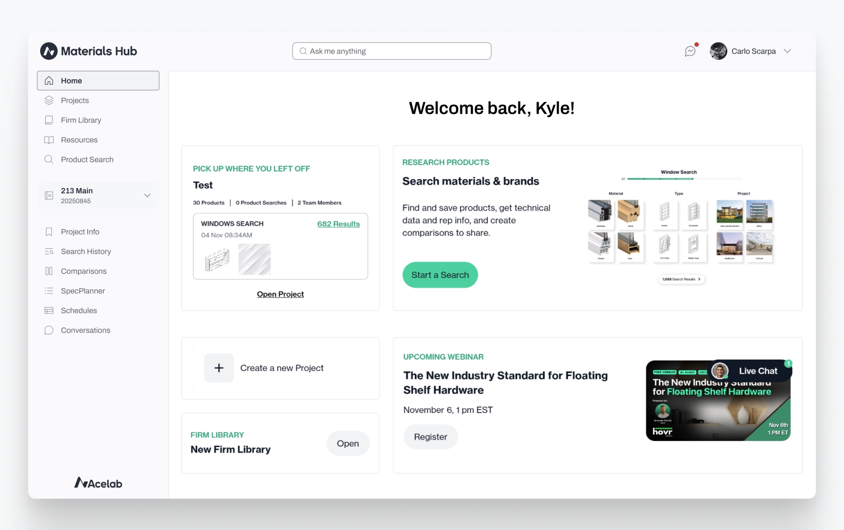
Inconsistent context.
Menus changed based on the current view. Users couldn't build a repeatable mental map of where to find things.
The "Project Ghost" state.
Users would enter a project workspace, but the visual indicator would disappear. They lost track of whether they were editing a specific project or viewing global resources.
Missing professional context.
Project selectors showed only project names. Architects manage workflows via Project Numbers; this omission made the tool feel amateur to professional firms.
The top-nav ceiling.
The platform exclusively used horizontal top navigation. It had reached capacity. Adding features meant burying them in "More..." menus that users ignored.
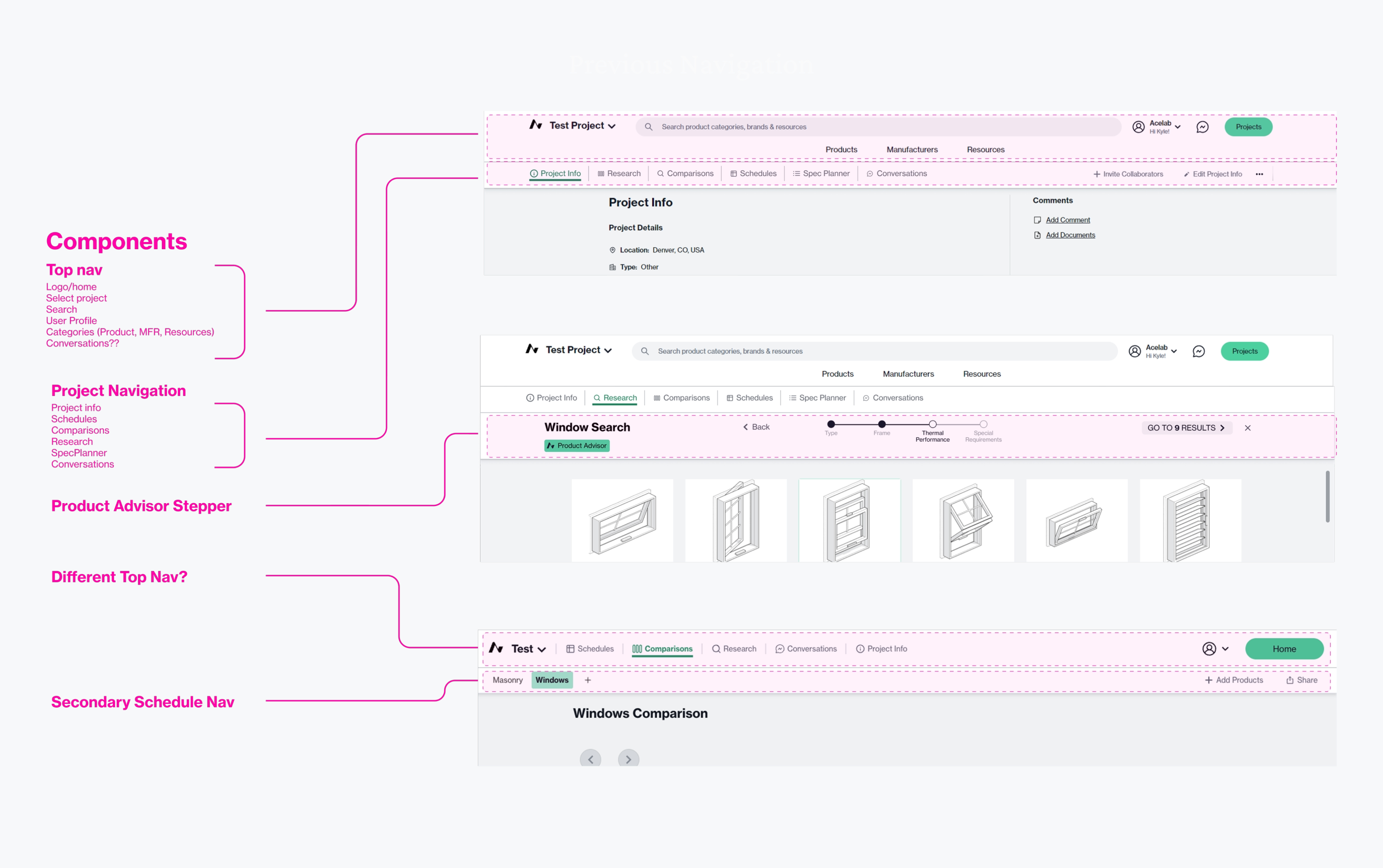
Legacy navigation varied by view and hid project context
Research: Validating Direction Without a Research Budget
After creating a handful of concepts, the team initially favored a direction inspired by consumer products—clean, minimal, lots of whitespace. I conducted 8 conversational interviews with architects across firm types and sizes, from boutique residential practices to global firms like Gensler. Some were existing Acelab users; others were contacts in my network I recruited to get outside perspective.
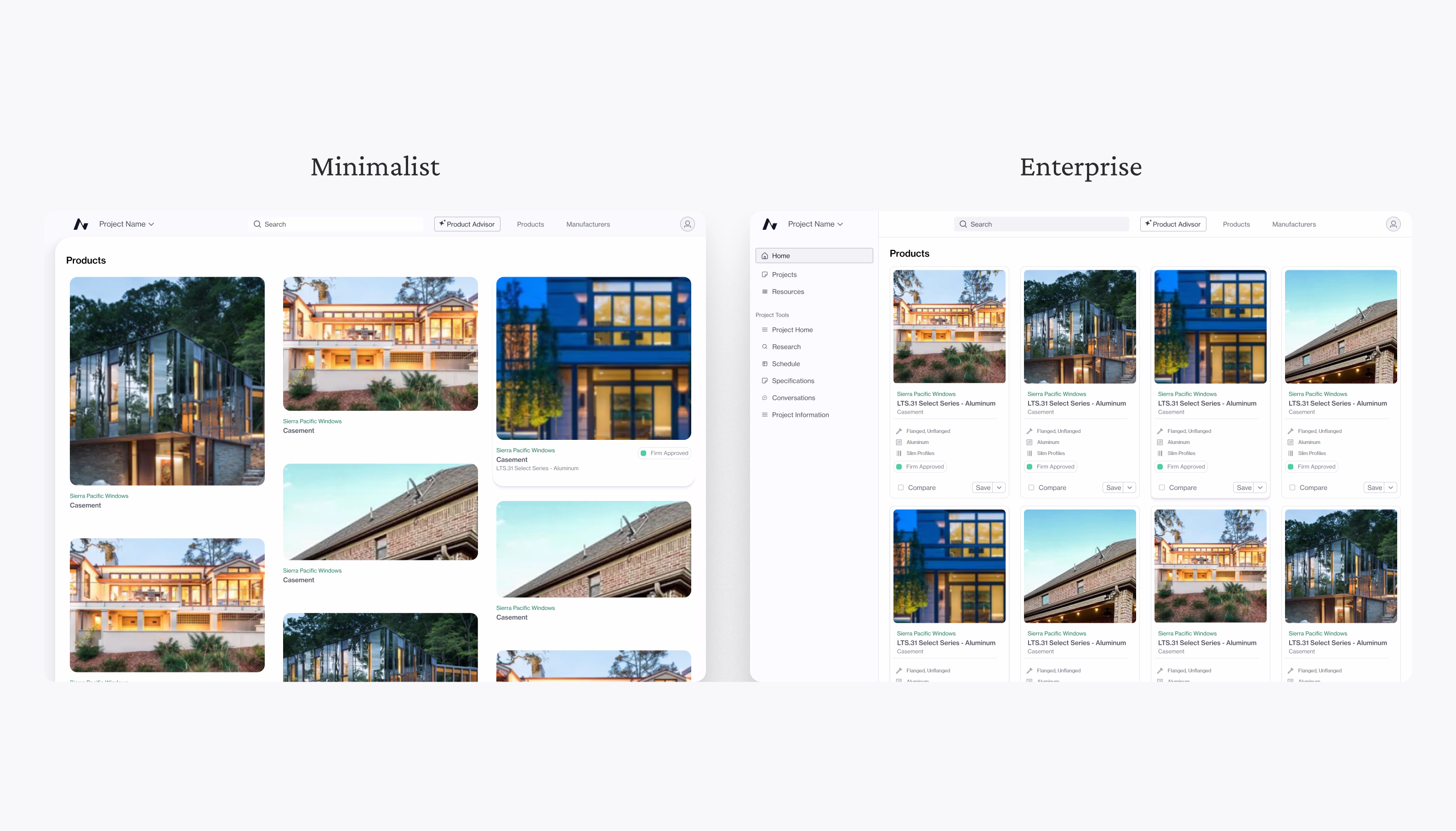
I walked them through lo-fi clickable prototypes showing different navigation patterns and aesthetic directions. When presenting the direction our team was set on, the feedback was consistent:
“I don't trust this at all.”
“It feels too young or modern.”
“It doesn't feel like I know if the information will be trustworthy.”
Architects spend their days in dense, data-heavy tools like Revit and Bluebeam. They don't need lifestyle branding; they need professional utility that signals competence at a glance.
Lo-fi prototypes used in architect interviews
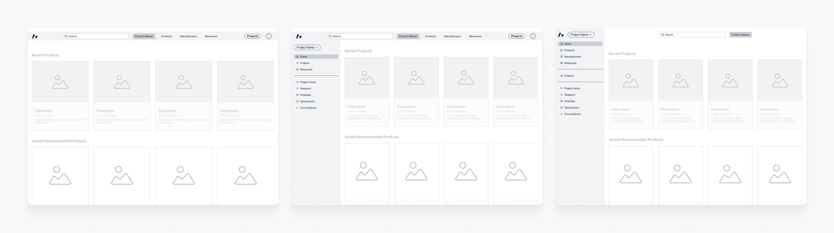
Strategy: Advocating for Professional Density
For professional users managing complex projects across multiple stakeholders, visual minimalism can signal superficiality. Dense, well-organized navigation communicates capability. This created a design tension: the CEO prioritized global search (which worked best in a clean top nav), while feature discoverability needed persistent, visible structure. The solution: Hybrid navigation. This gave both priorities room to breathe while respecting how architects actually work.
Exploring hybrid navigation: top nav + persistent sidebar
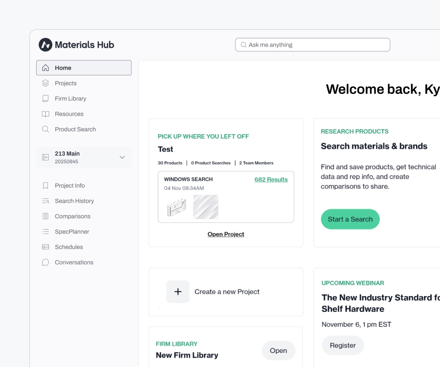
Execution: Scoping for Impact Within Timeline Constraints
The CEO was pushing to ship features rapidly. A full platform rewrite wasn't feasible. I worked with Engineering to define a "Canvas" approach: a new global navigation frame that wrapped existing page content. This allowed us to: • Ship high-impact navigation changes without blocking feature development • Establish a design system foundation that could be applied incrementally to inner pages • Validate the mental model (hybrid nav, persistent project context) before deeper refactoring
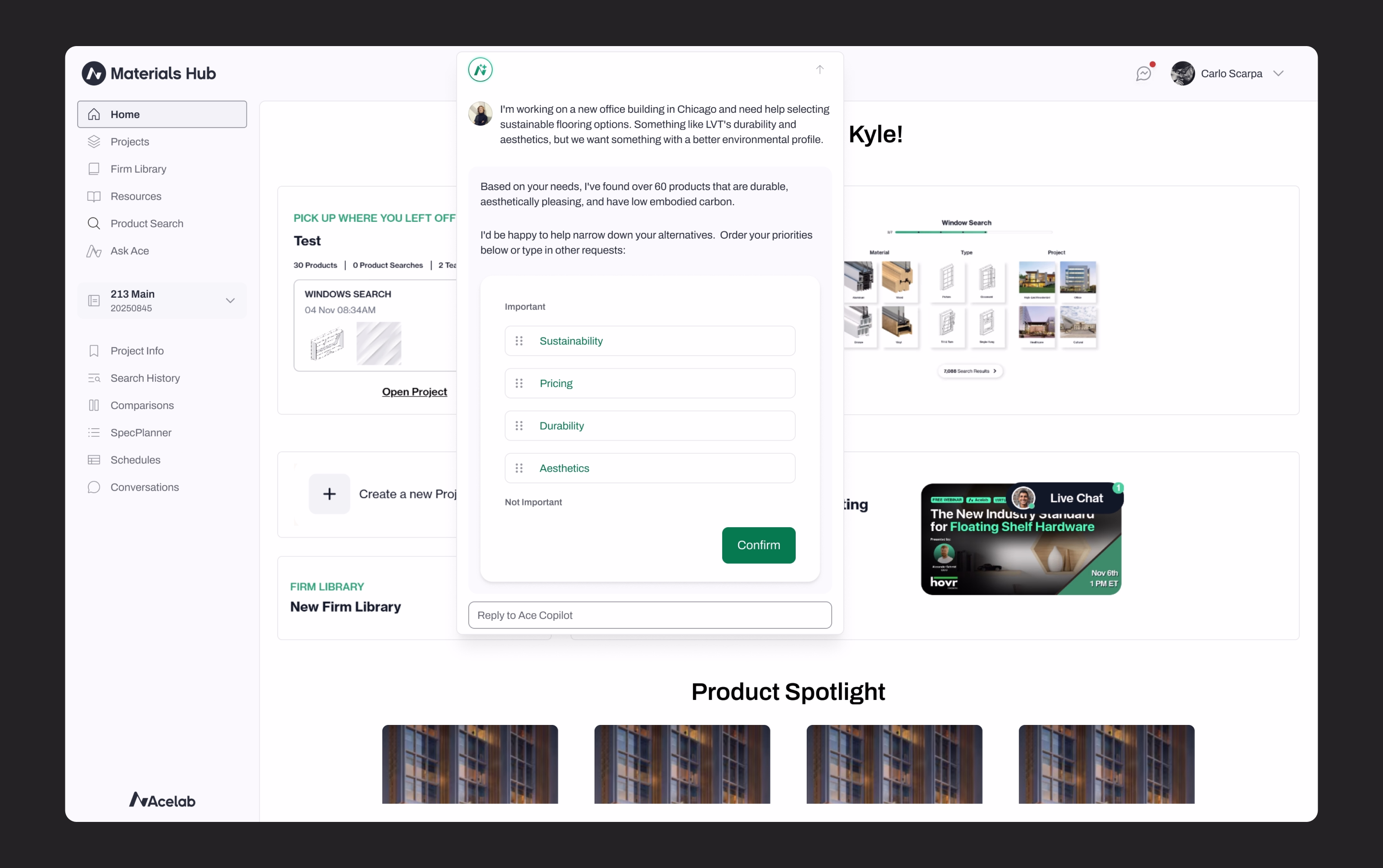
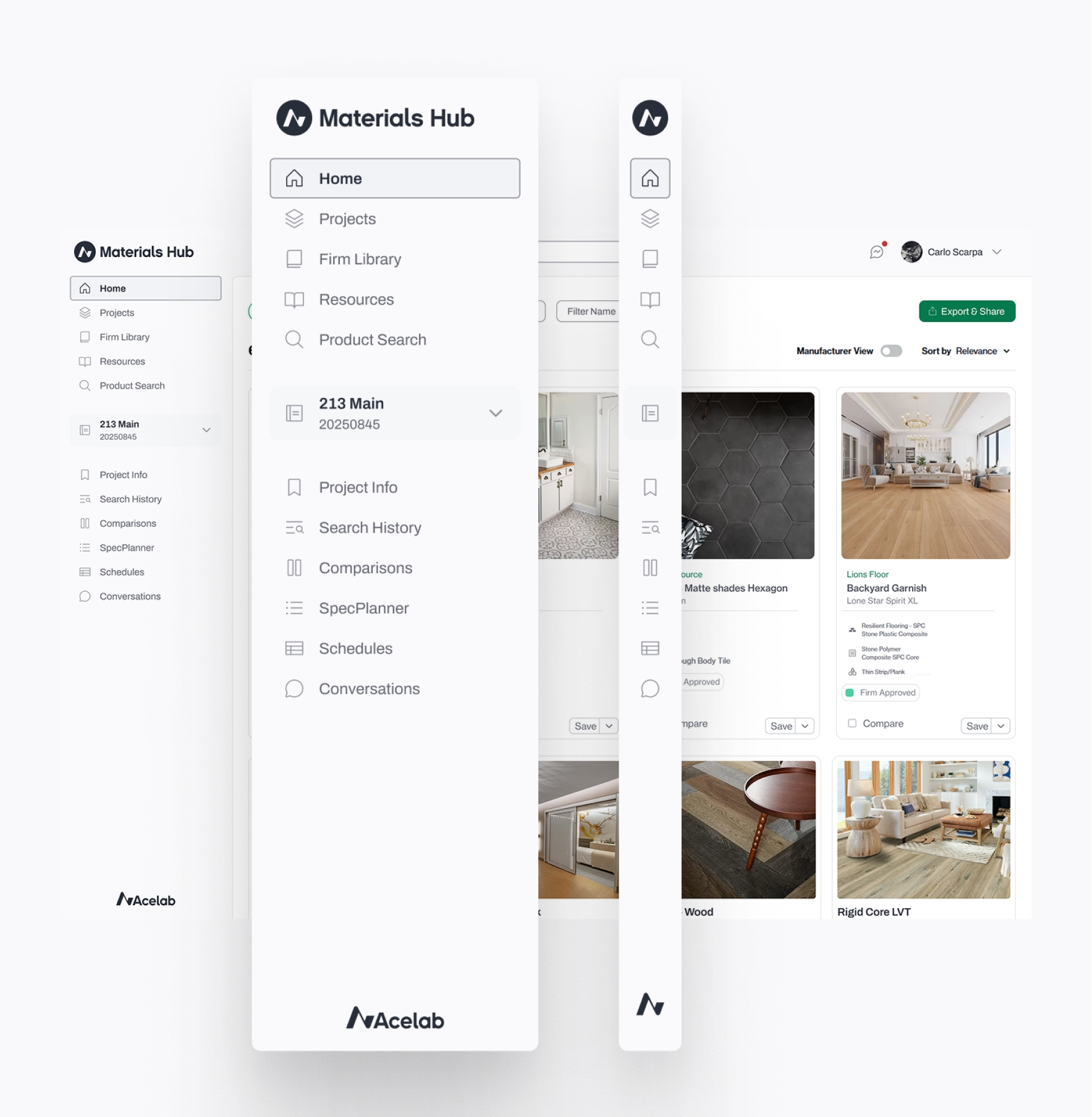
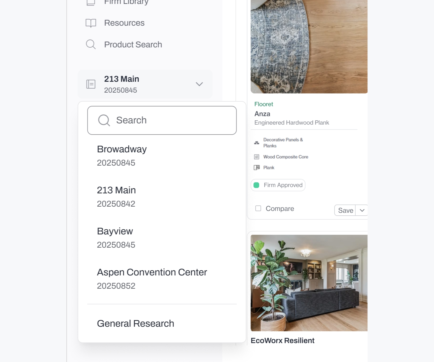
Persistent project context
The project selector now displays project numbers, the way architects actually identify work, eliminating the "ghost state" where users lost track of which project they were in.
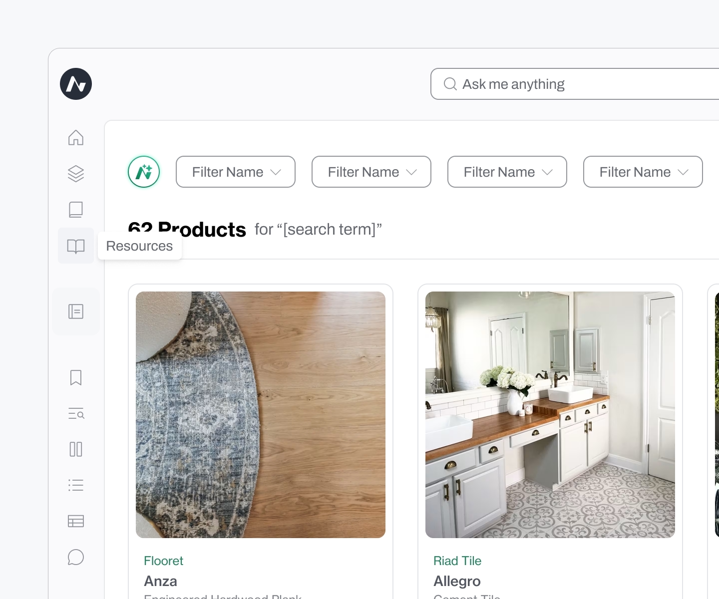
Stable navigation
The sidebar stays consistent across the platform, giving users a reliable "home base" regardless of page depth.
Professional density
Information-rich layouts that favored utility over empty space.
Outcome: Durability and Business Impact
The navigation and design system launched in late 2024 and remain in use today. Internal feedback validated the approach:
“We've gotten lots of good feedback on the UX/UI and overall flow... the designs have gotten very good feedback, and I hope you are proud of them.”
In early 2025, Acelab announced $13.5M in Series A funding led by Navitas Capital, with participation from strategic investors including JLL Spark, architects from BIG (Bjarke Ingels Group) and SHoP Architects, and returning investors Pillar VC and Draper Associates. While navigation wasn't the sole driver, it demonstrated to professional users, and investors, that Acelab understood the workflows and mental models of architects.
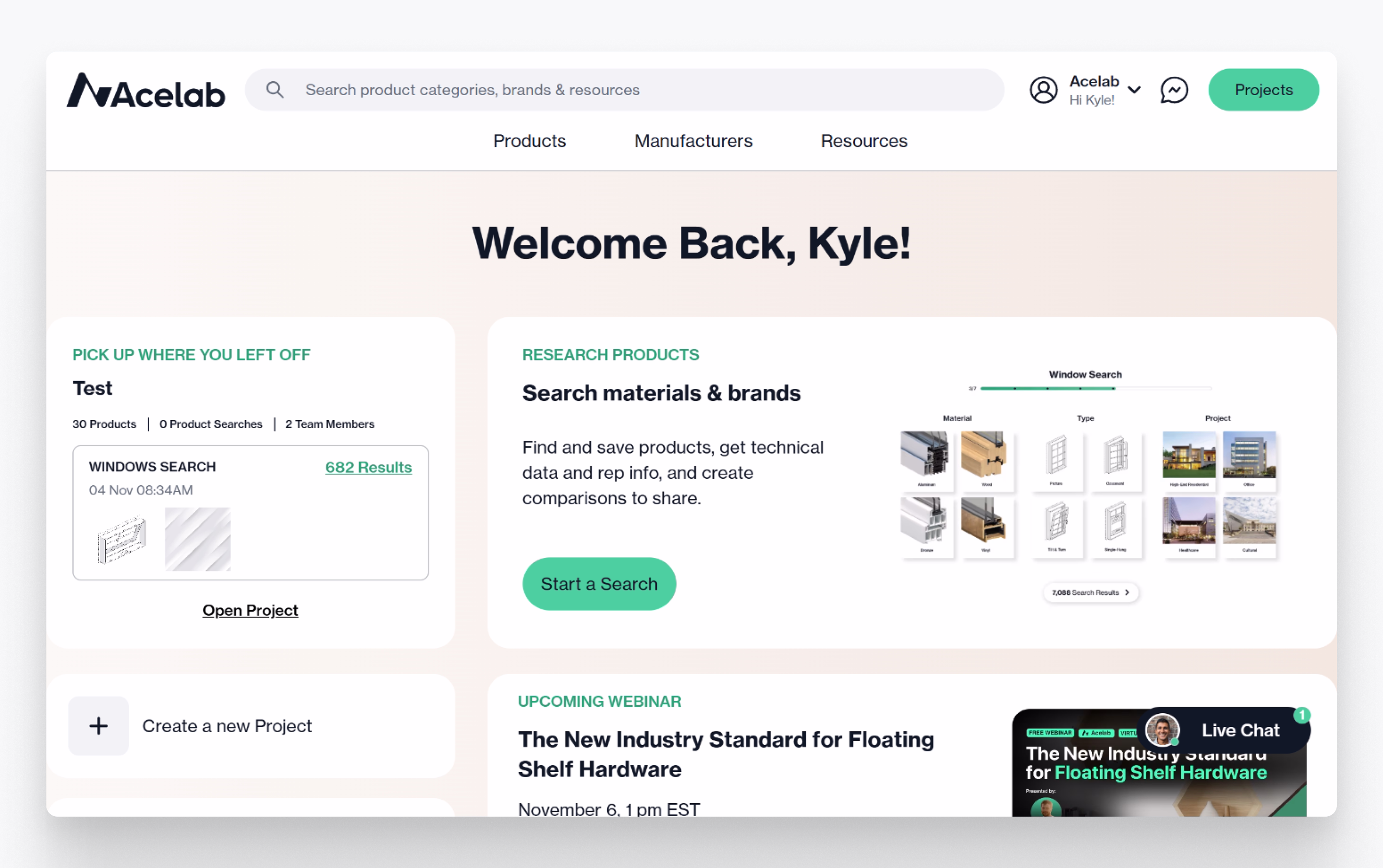
Final navigation: project selector with numbers, stable sidebar