Lighthouse
I redesigned real estate planning tools that enabled 50% faster report generation for Google REWS.
Impact & measurement
50% faster report generation measured via planner time-tracking and feedback over the first 3 months post-launch.
Role
Product Designer
Client
Employer
Outer Labs
Focus areas
Design, Strategy
Team scope
Sole designer; partnered with product and engineering. User research with Google planners informed prioritization.
Overview
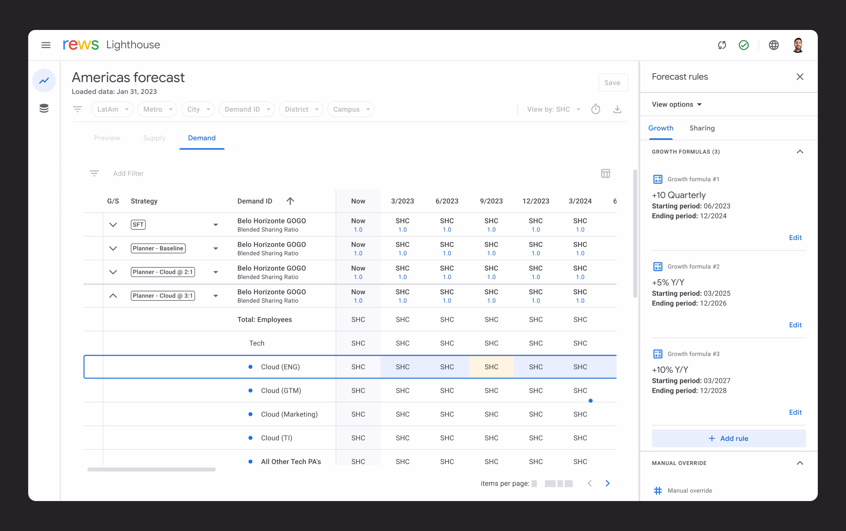
Lighthouse is a web-based application designed to model all of Google's global office space 10 years into the future. Built to meet the needs of real estate planners and analysts at Google Real Estate and Workplace Services (REWS), it transitions their workflows from a spreadsheet-based system to a more robust and user-friendly web-based platform. The result? Lighthouse enabled 50% faster report generation for the planners and forecasters, transforming how Google manages hundreds of millions of square feet of office space worldwide.
Lighthouse application demonstration
Background (Spreadsheet mania)
Currently Google models their hundreds of millions of square feet of global office space and millions of employees in a collection of Google Sheets files. The global group of planners who are modeling supply and demand scenarios to study long-term requirements of office space needed a more streamlined, consistent, and fast approach. Pain points included: infinitely configurable (no guardrails), lack of automation (tedious, manual process), no data hierarchy and minimal organization, and no filtering available.
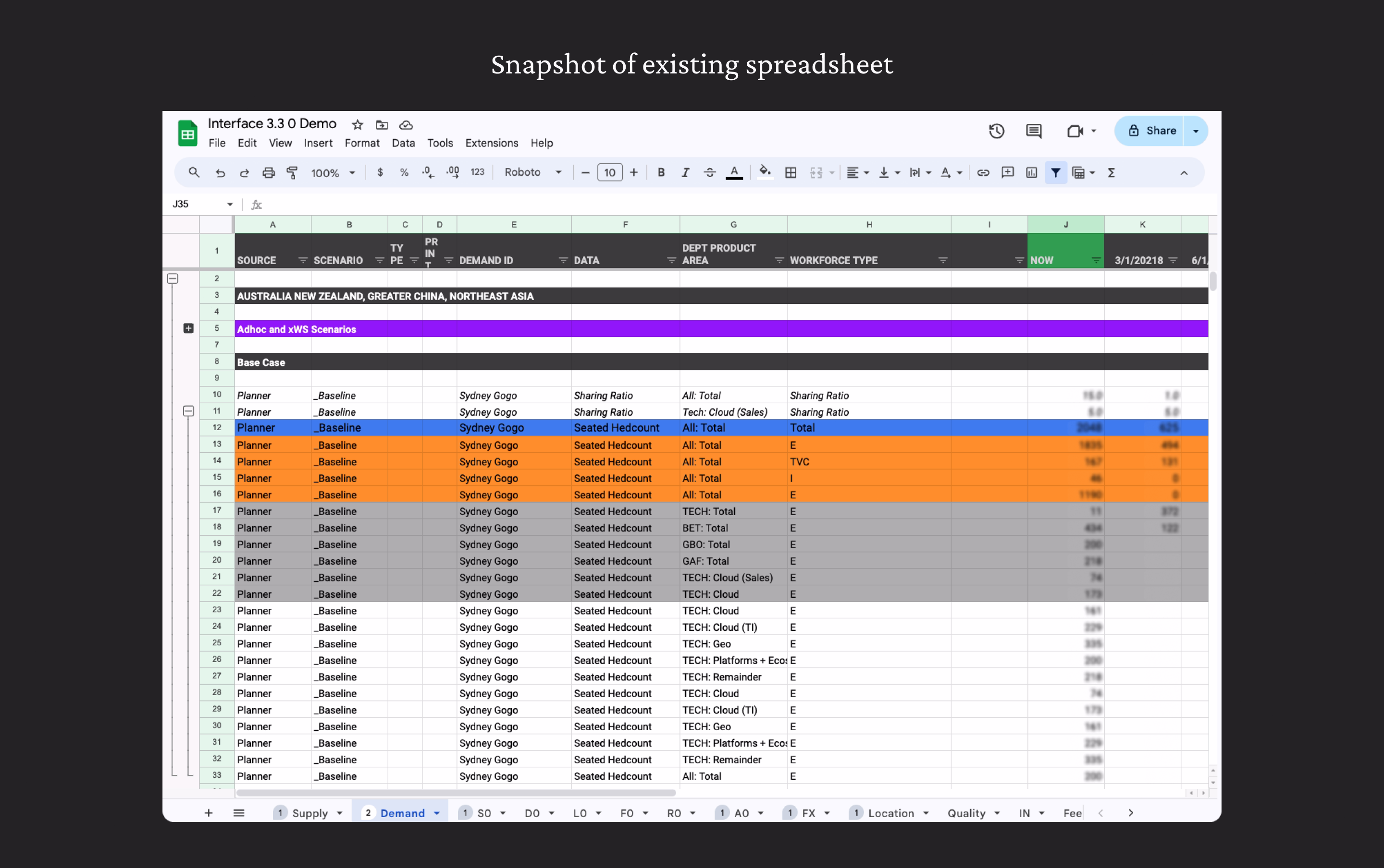
Existing tool that Google planners use (Sheets)
Approach
With two primary goals—streamlining modeling processes and improving data visualization—I took the following approach: Mapped Existing Pain Points by conducting user research with Google planners to understand the workflow and prioritize solutions. Simplified Operations by designing a logical set of operations to enable consistent forecasting and scenario modeling. Crafted Visual Hierarchy & Feedback so interfaces highlighted data relationships, recent changes, and high-level insights at a glance.
Side panel allowing users to quickly show & hide relevant data
Solution
Lighthouse gives planners a structured, purpose-built environment where forecasting is faster, customizations are visible, and consistency is built in. The result is less time wrestling with data and more confidence in the output.
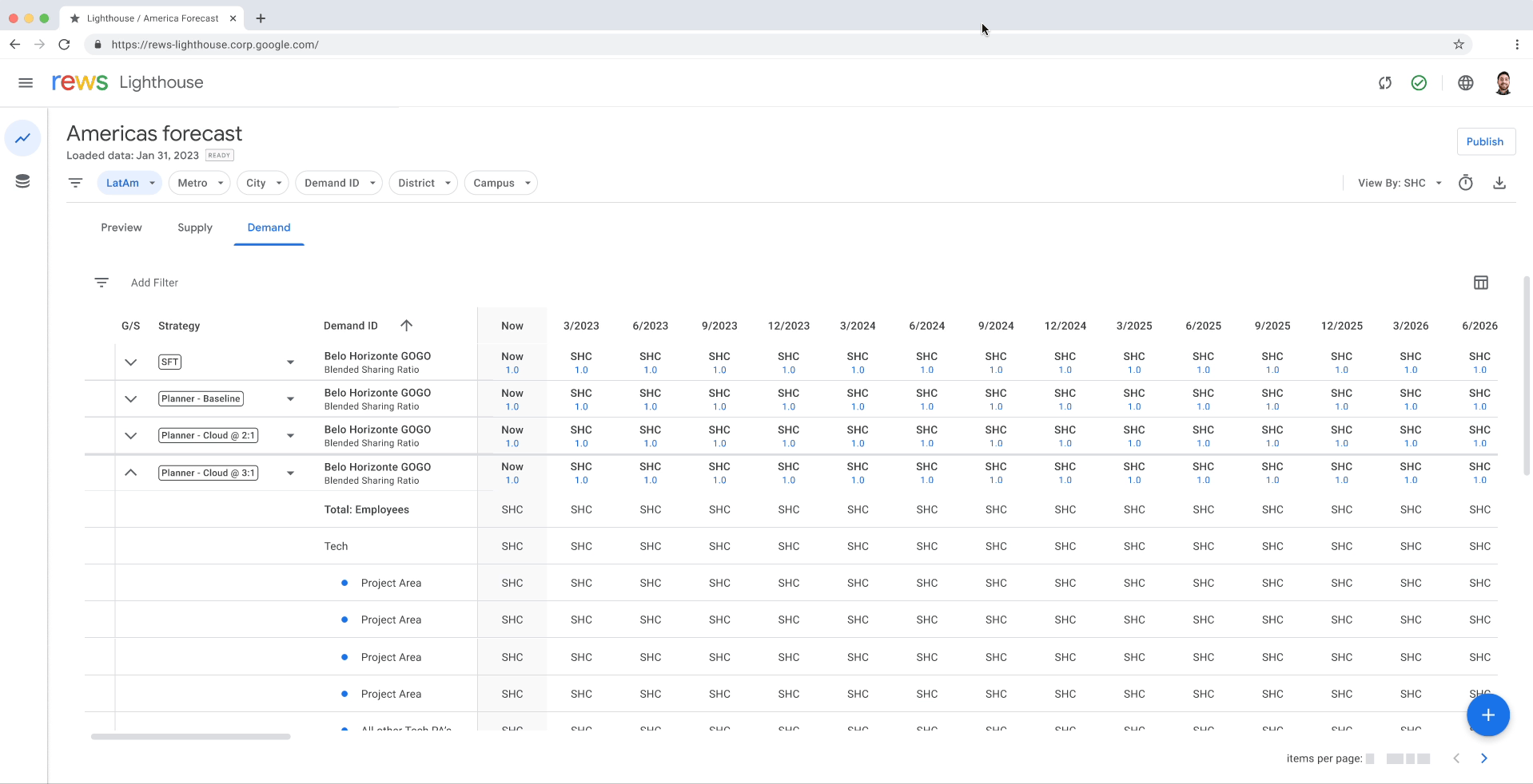
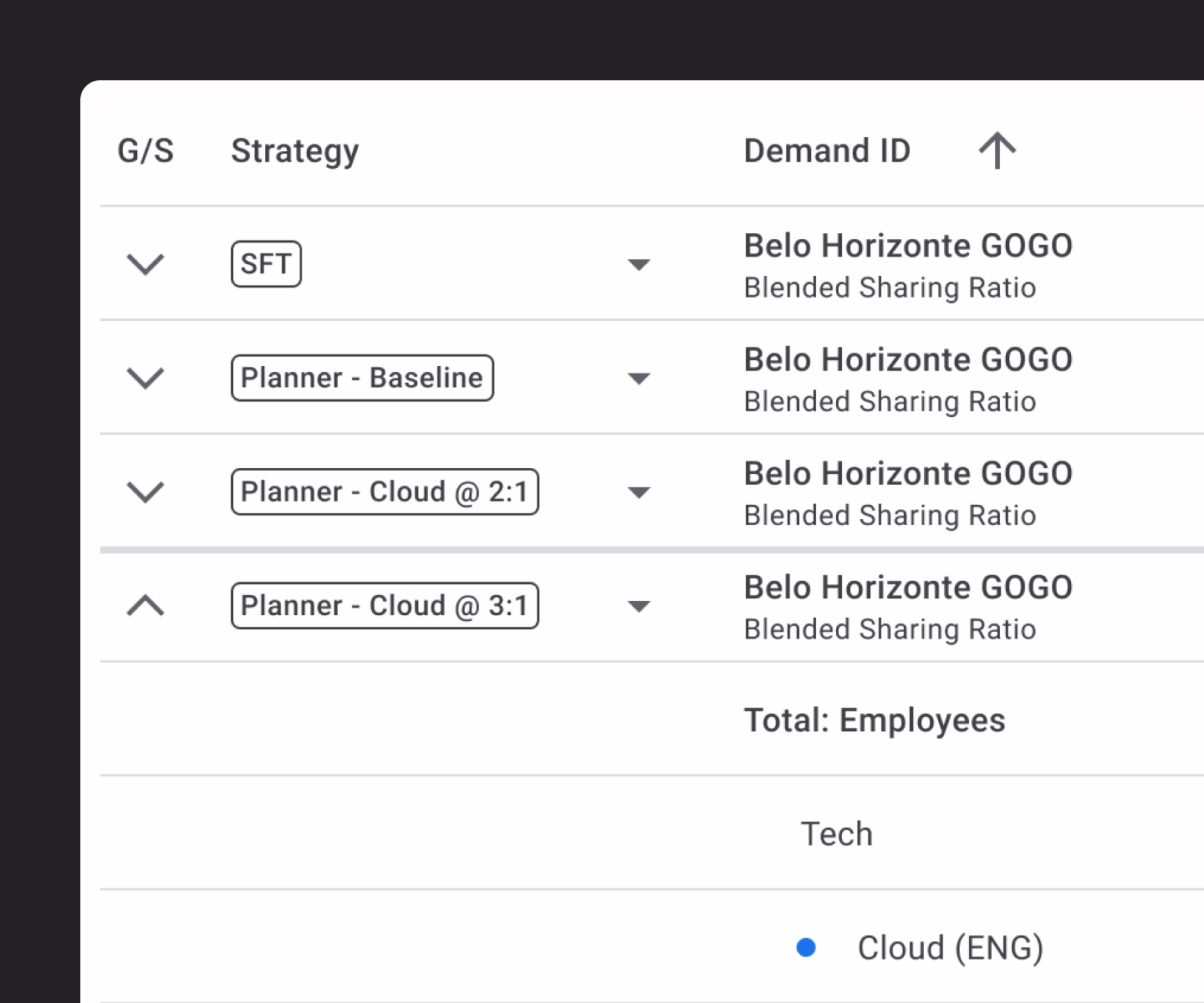
Clear data hierarchy
Organized structure for complex planning data. So planners always know where they are in a dataset spanning hundreds of offices across dozens of regions.
Nested structure showing how regional and local office data is organized
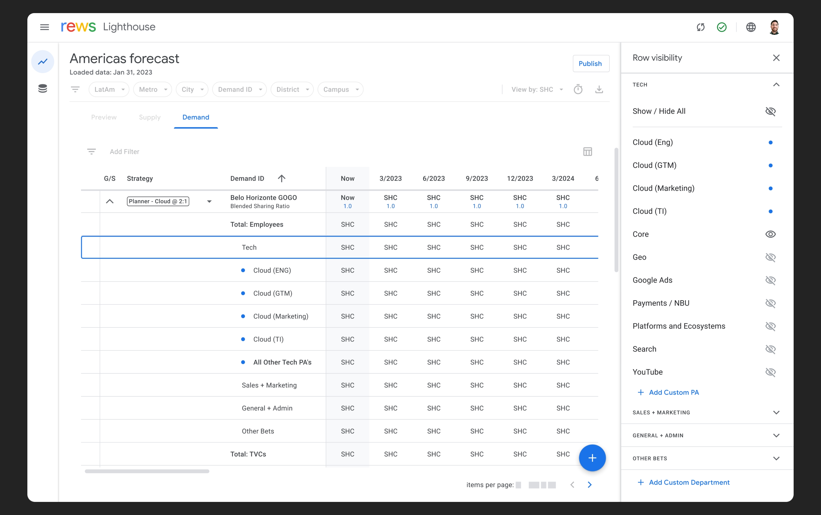
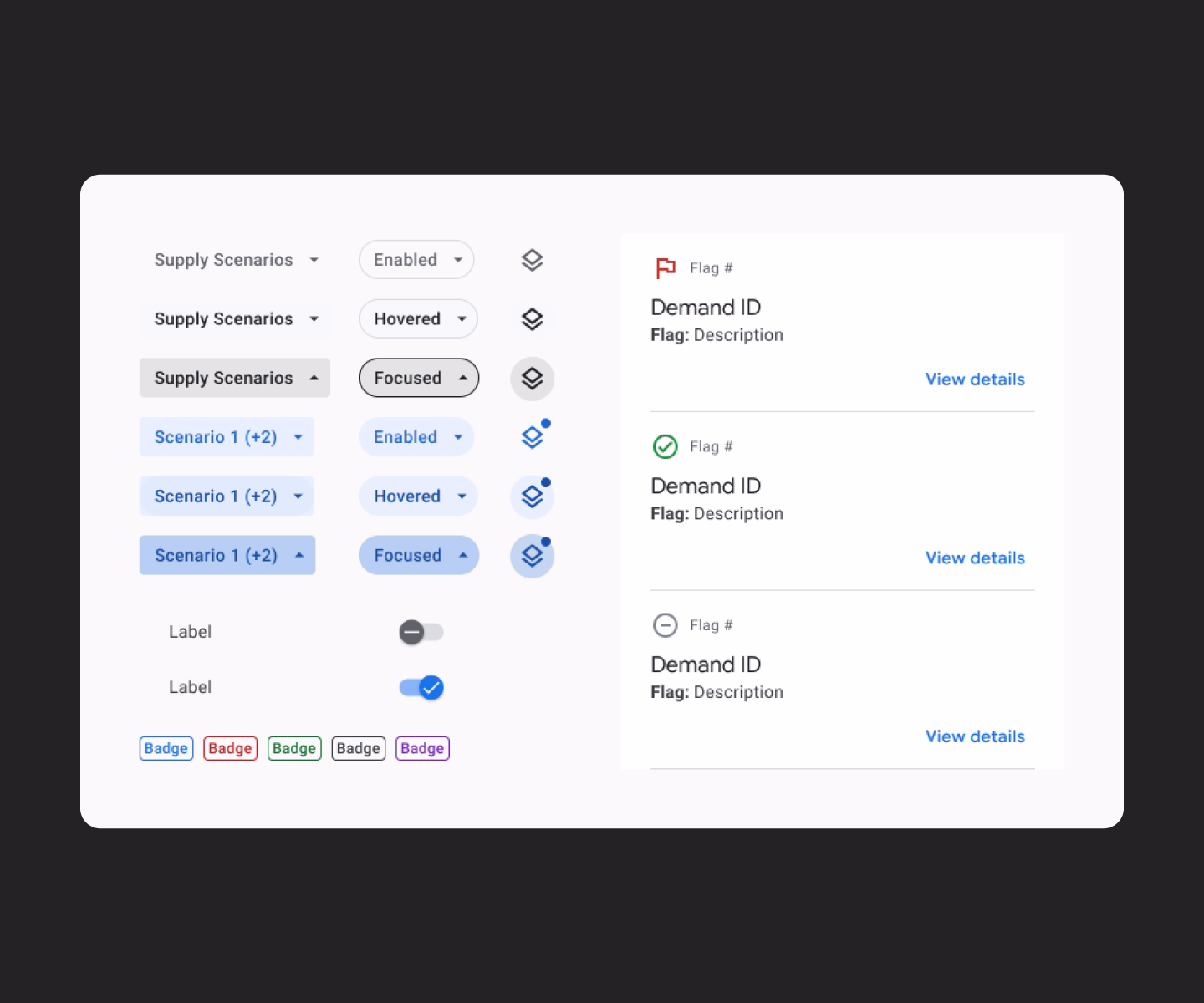
Global & local filtering
Flexible filtering and sorting at multiple levels. Less time reconstructing views, more time actually analyzing the data that matters.

Filters can be applied simultaneously at the global and row level
Simple & powerful logic
Intuitive customization without complexity. Guardrails keep forecasts consistent across teams — without taking control away from the people who know the data best.
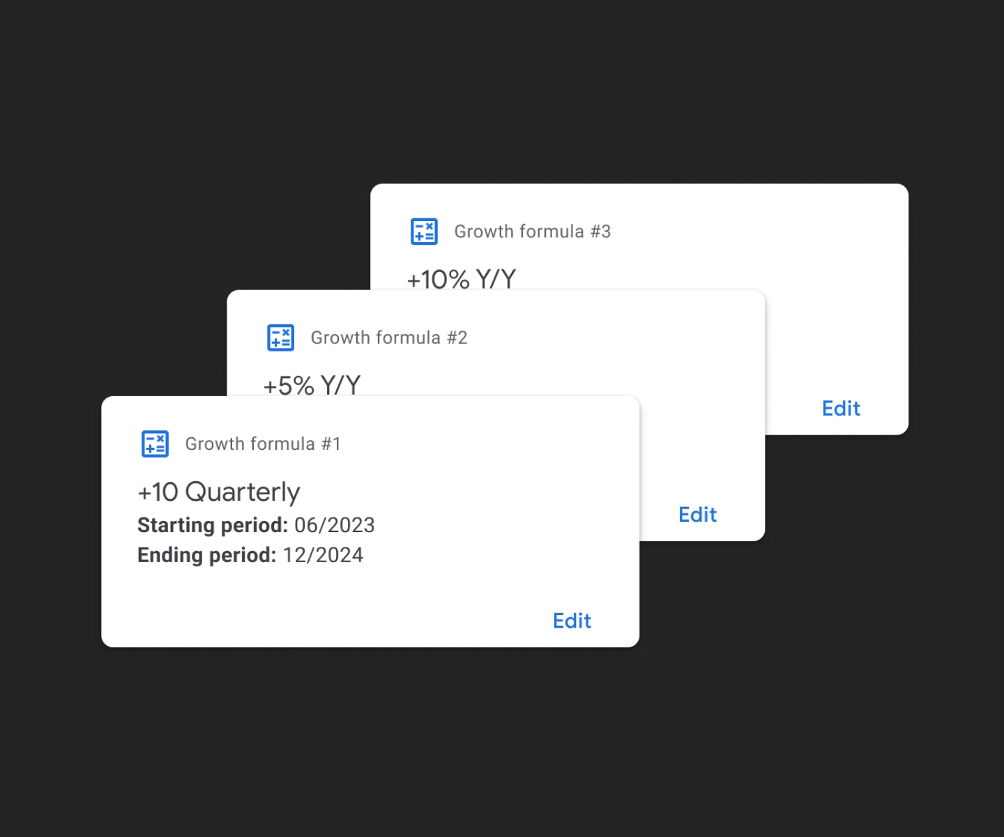
Rule-based logic applied across multiple forecast periods
Visual cues
Clear indicators for customizations and changes. Planners can review, audit, and hand off work with confidence — no more hunting for what changed or why.
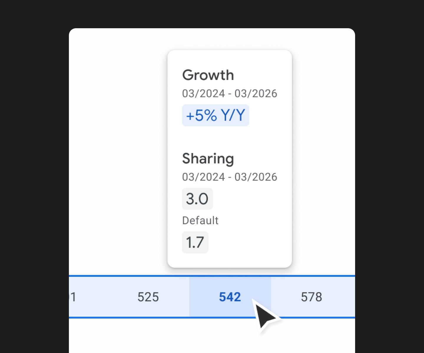
Indicators highlighting active customizations and recent edits
Design System
I was working within the Google Material design system, with a specific UI overlay on top of the default Material 2 library for REWS products. This system was not fully fleshed out, so throughout the course of development I had to create and manage some additional components. Because of very tight build timelines, all of the components used had to be rigorously consistent with what is available in the existing Angular and React libraries.
Design system components
Impact & results
The Lighthouse application introduced several significant improvements: Automated Calculations—blended sharing ratios are now automatically calculated, saving planners up to 50% of their time preparing reports. Enhanced Data Visibility—a toggle feature allows users to easily switch views. Rule-Based Adjustment—users can apply rule-based calculations across multiple periods. Consistent UI Across Regions—a standardized UI improves usability. Upstream Data Integration—direct integration with upstream data sources eliminates manual linking.
Prototype showing a user making a forecast growth modification