Syncrofy
Redesigning filtering to handle 200,000+ enterprise data transfers per hour without overwhelming users.
Impact & measurement
Outcomes grounded in forensic audit of legacy usage data (99% of filter interactions in 8 facets). Validated through stakeholder alignment and post-launch feedback.
Role
Lead Product Designer (sole designer)
Employer
CoEnterprise
Focus areas
Full platform UI redesign, Transfer List, Dashboards
Team scope
Sole designer; partnered with CEO, Director of Product, PM, and Engineering. 4-month single-release timeline.
Context
Enterprise data exchange is often invisible until something breaks. Syncrofy FT exists to act as a GPS for digital mail, giving business and technical users real-time visibility into every transfer across systems. The project was driven by a CEO-led vision for a single, massive release. This meant no room for iterative research or incremental analytics. Furthermore, the CEO mandated 100% feature parity, meaning no filters could be removed, regardless of how rarely they were used. Timeline: 4 months, single-release redesign. Partners: CEO, Director of Product, PM, Engineering.
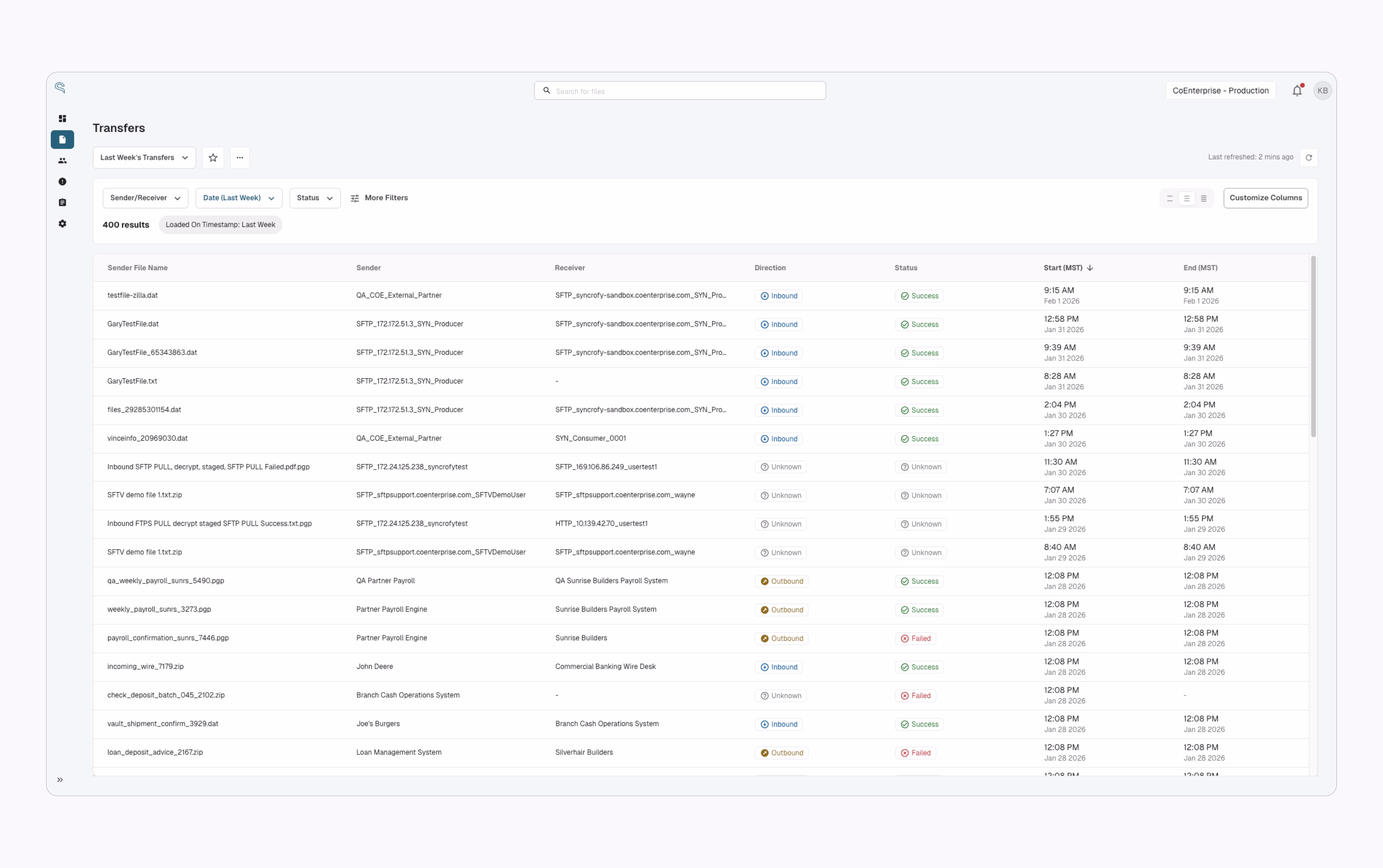
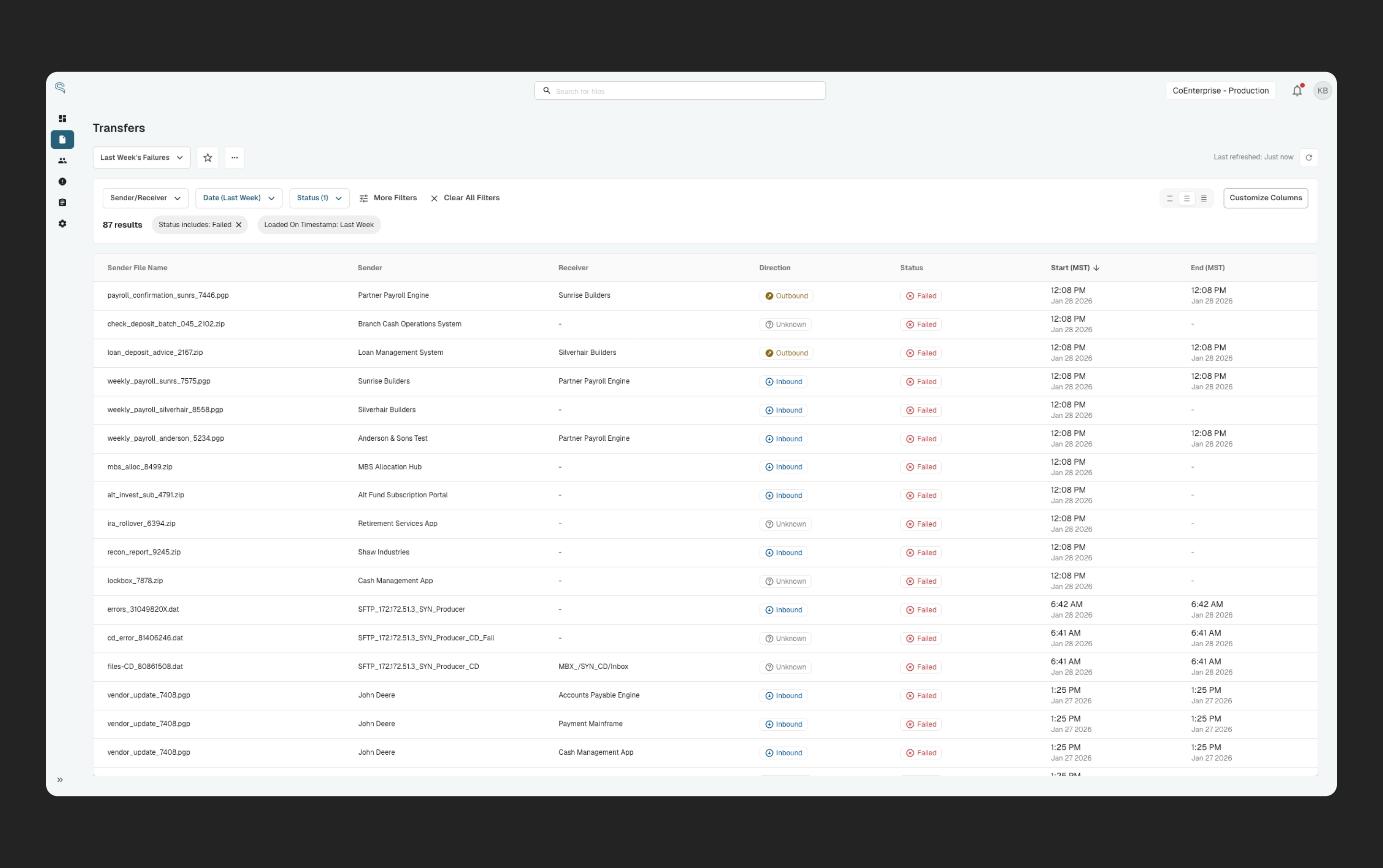
Transfer list and visibility into enterprise data exchange
Why it mattered
Syncrofy File Transfer (FT) handles 200,000+ enterprise data transfers per hour. My goal was to turn an opaque "black box" of activity into a system users could quickly search, understand, and trust.
The Problem: When Flexibility Becomes Friction
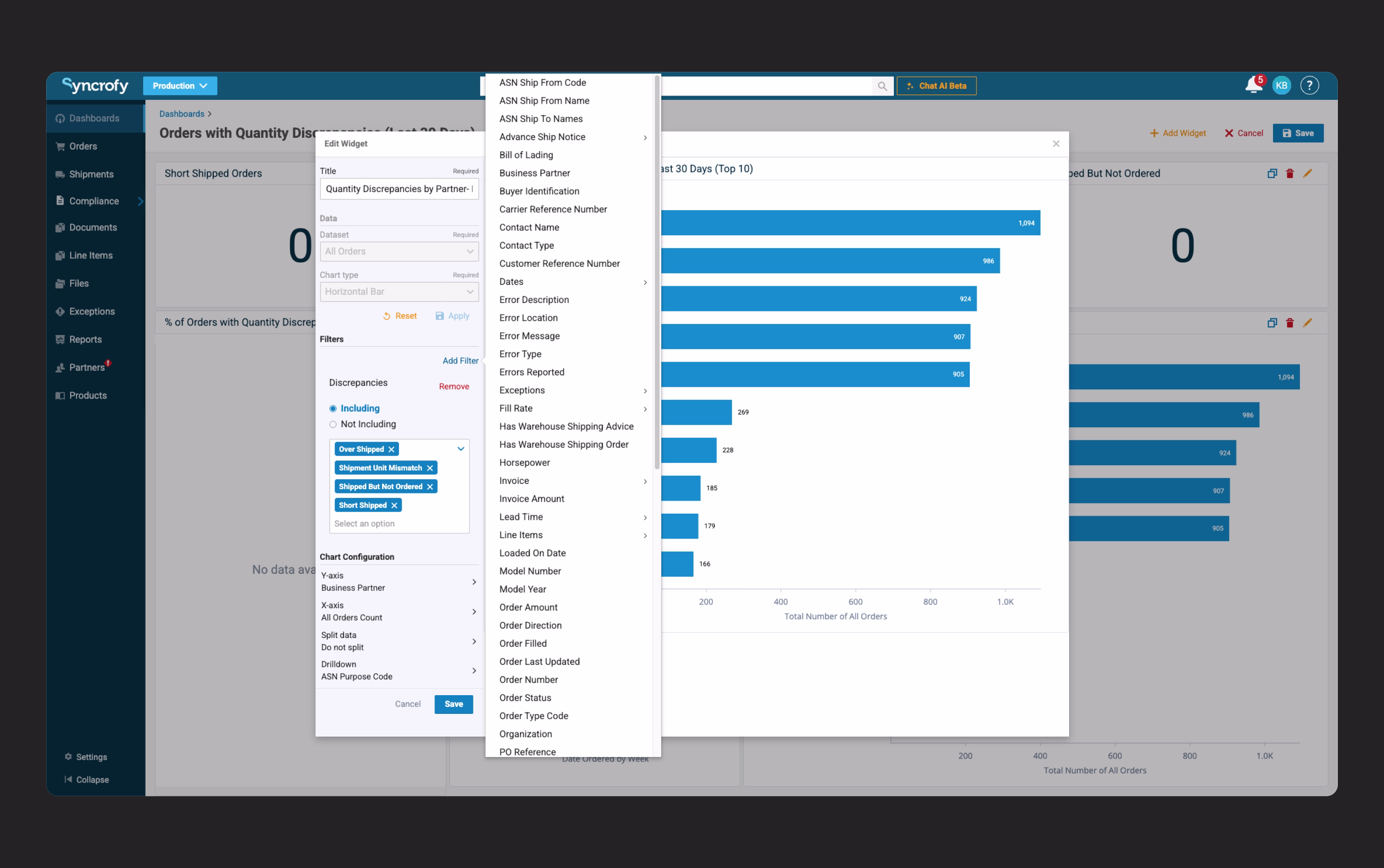
Syncrofy's legacy platform exposed 50+ filter options on the transfer list. This approach maximized theoretical flexibility, allowing power users to slice data by nearly every available facet. It also has the potential to be overly complex. New and non-technical users were overwhelmed by the sheer number of options. Even experienced users had to scroll through long lists to perform simple tasks. Instead of empowering users, the interface increased cognitive load and slowed down workflows. The underlying assumption was clear: More options equal more power. But that assumption hadn't been re-examined in years.
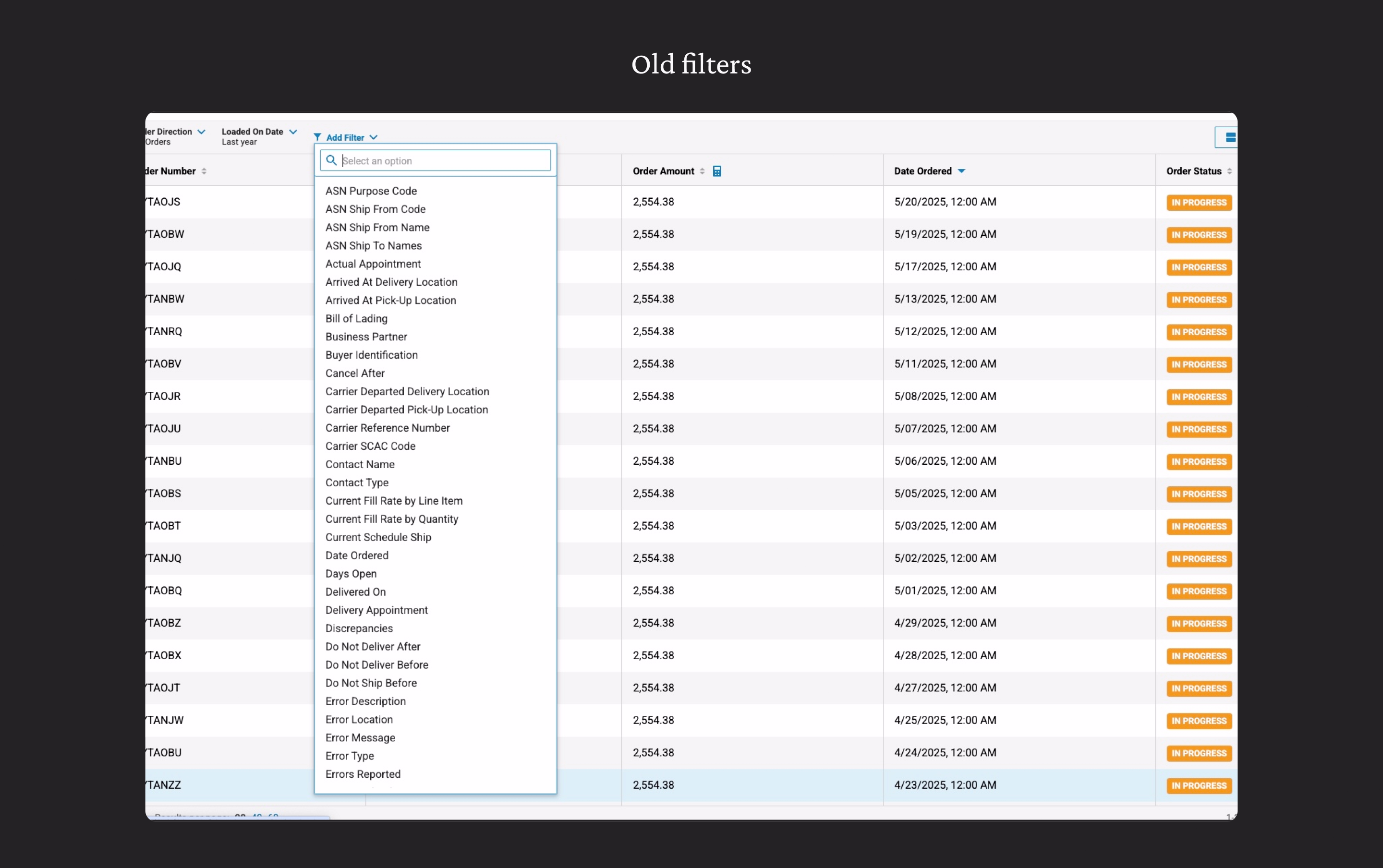
Legacy platform exposed 50+ filter options on the transfer list
The Core Problems
Through legacy audits and stakeholder alignment, four core problems emerged:
Cognitive overload.
Users faced a flat list of 50+ filters, creating a "wall of choice" that slowed even simple workflows.
No safe path for advanced users.
Leadership required 100% feature parity, meaning no filters could be removed — even rarely used ones.
Loss of spatial awareness.
Active filters were hidden inside menus, causing users to lose track of how they arrived at a dataset.
Inconsistent dashboard filtering logic.
Filters behaved differently across tiles and dashboards, were temporary, and couldn't be reliably saved.
These issues were especially risky given the constraints: a CEO-driven vision, minimal research opportunity, and a single "Big Bang" release.
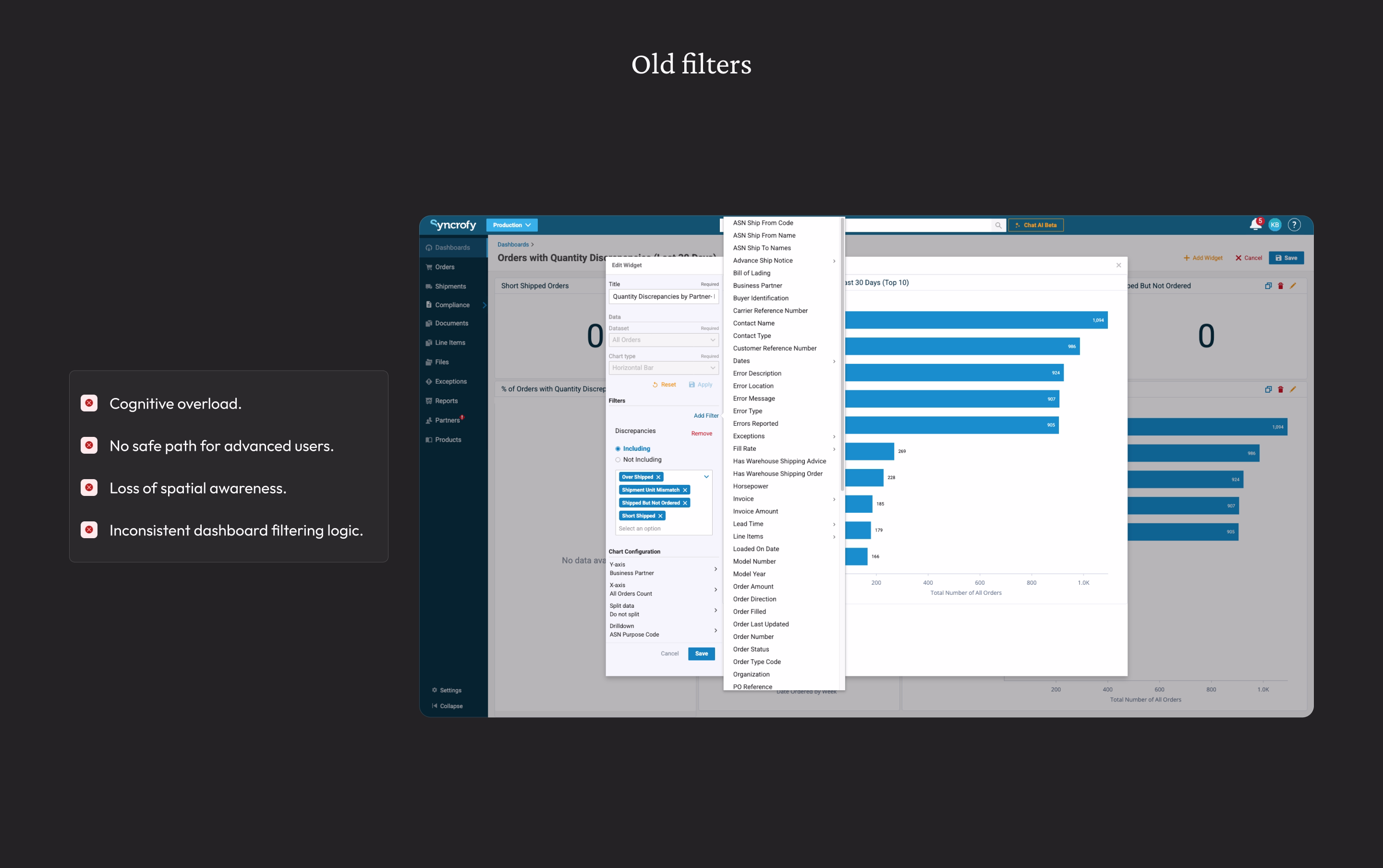
Core problems from legacy audits and stakeholder alignment
Insight: Designing for Reality, Not Possibility
To ground decisions, I conducted a forensic audit of legacy usage data. The result reframed the entire problem: 99% of all filter interactions were concentrated in just 8 filters. The issue wasn’t lack of capability — it was how that capability was presented. The design challenge became one of risk management: How do we dramatically reduce complexity for most users without removing power or violating leadership constraints?
The Solution: A focused default experience that also works for power users
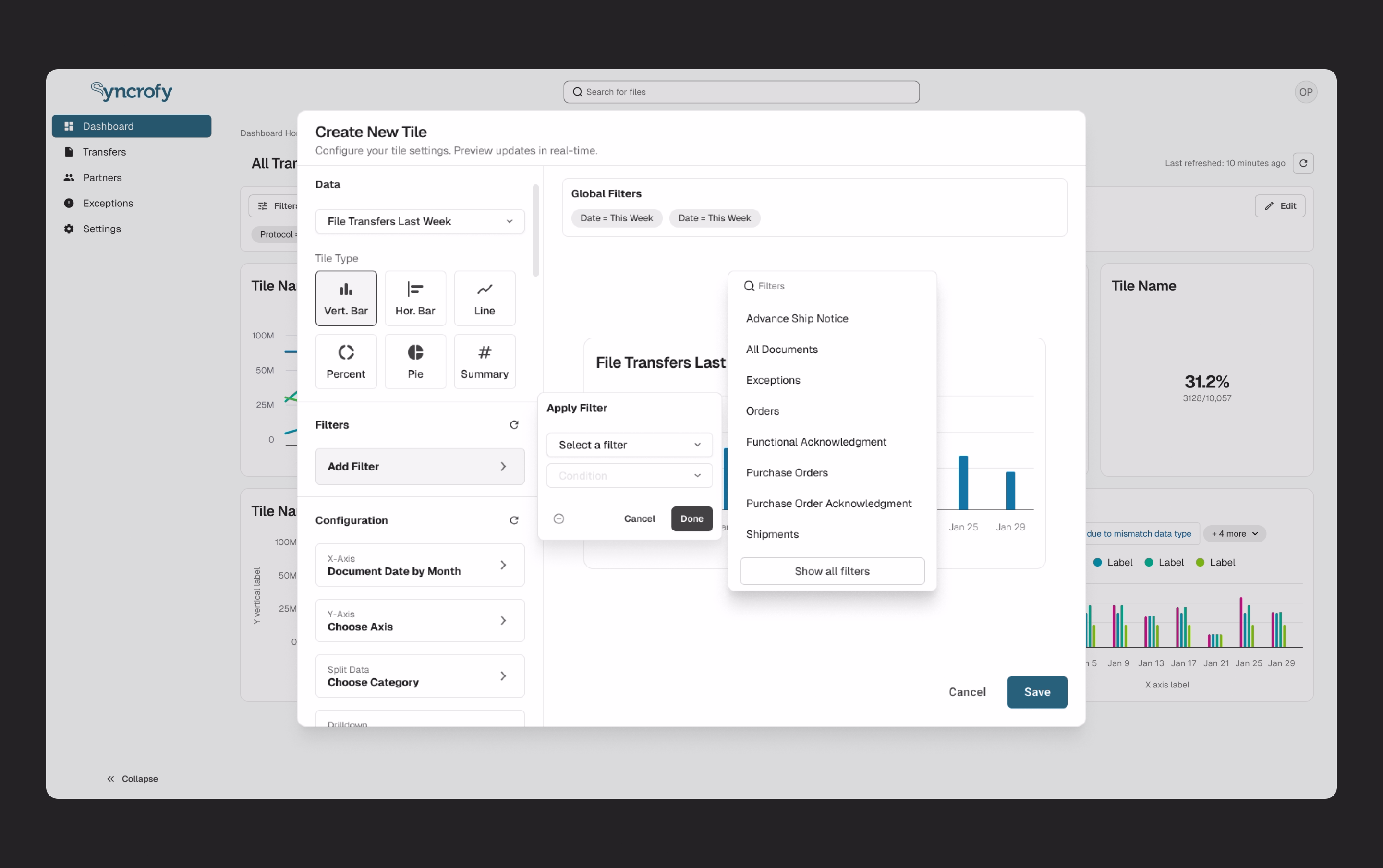
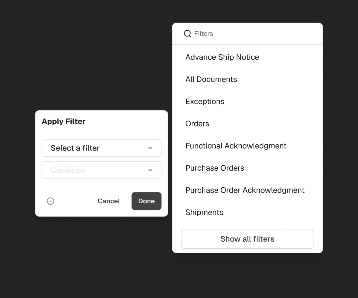
Progressive Disclosure to Reduce Overload
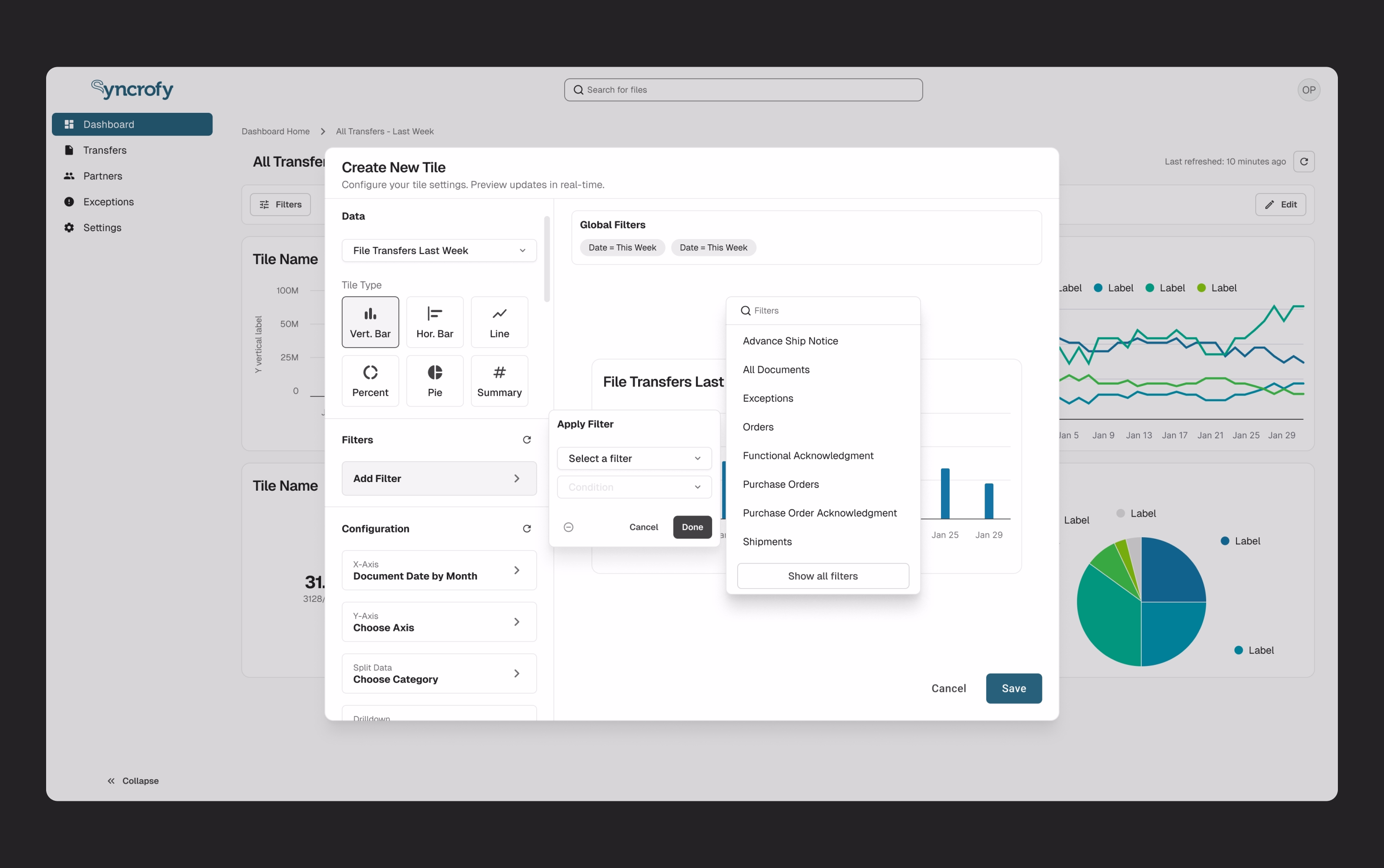
A usage audit revealed that 99% of filter interactions came from just 8 facets. I surfaced these as the default filter set and moved the remaining options behind an expandable, searchable drawer. This dramatically reduced visual complexity without removing capability. Preserving Power Without Sacrificing Clarity — To support expert workflows, all filters remained accessible via grouped categories and type-ahead search. This respected leadership concerns while creating a structured mental model for advanced use cases.
Default filter set focused on the Top 8 use cases
Preserving Power
All filters remained accessible via grouped categories and type-ahead search. This respected the 100% parity mandate while creating a structured mental model for advanced use cases.
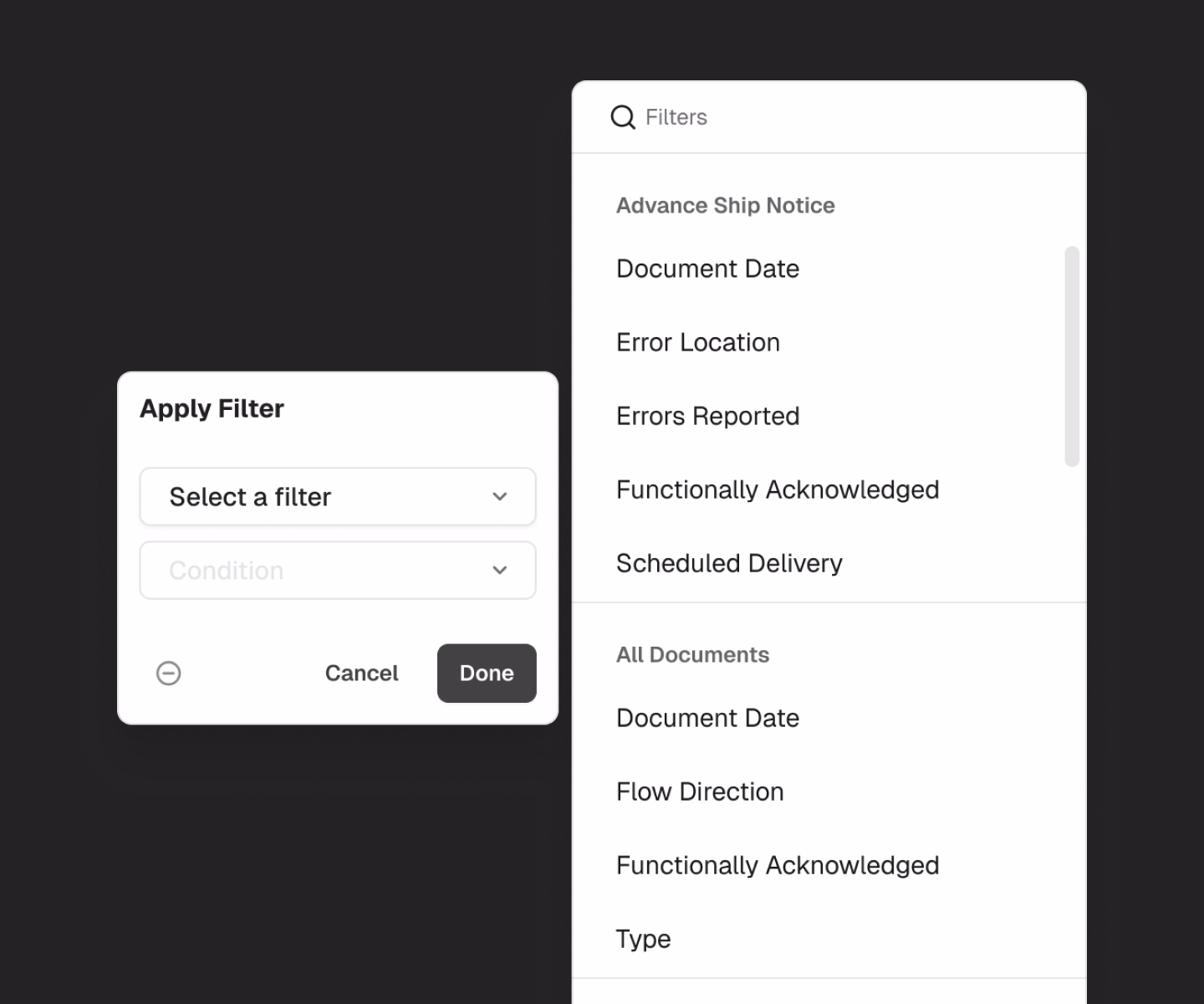
All legacy filters accessible through progressive disclosure
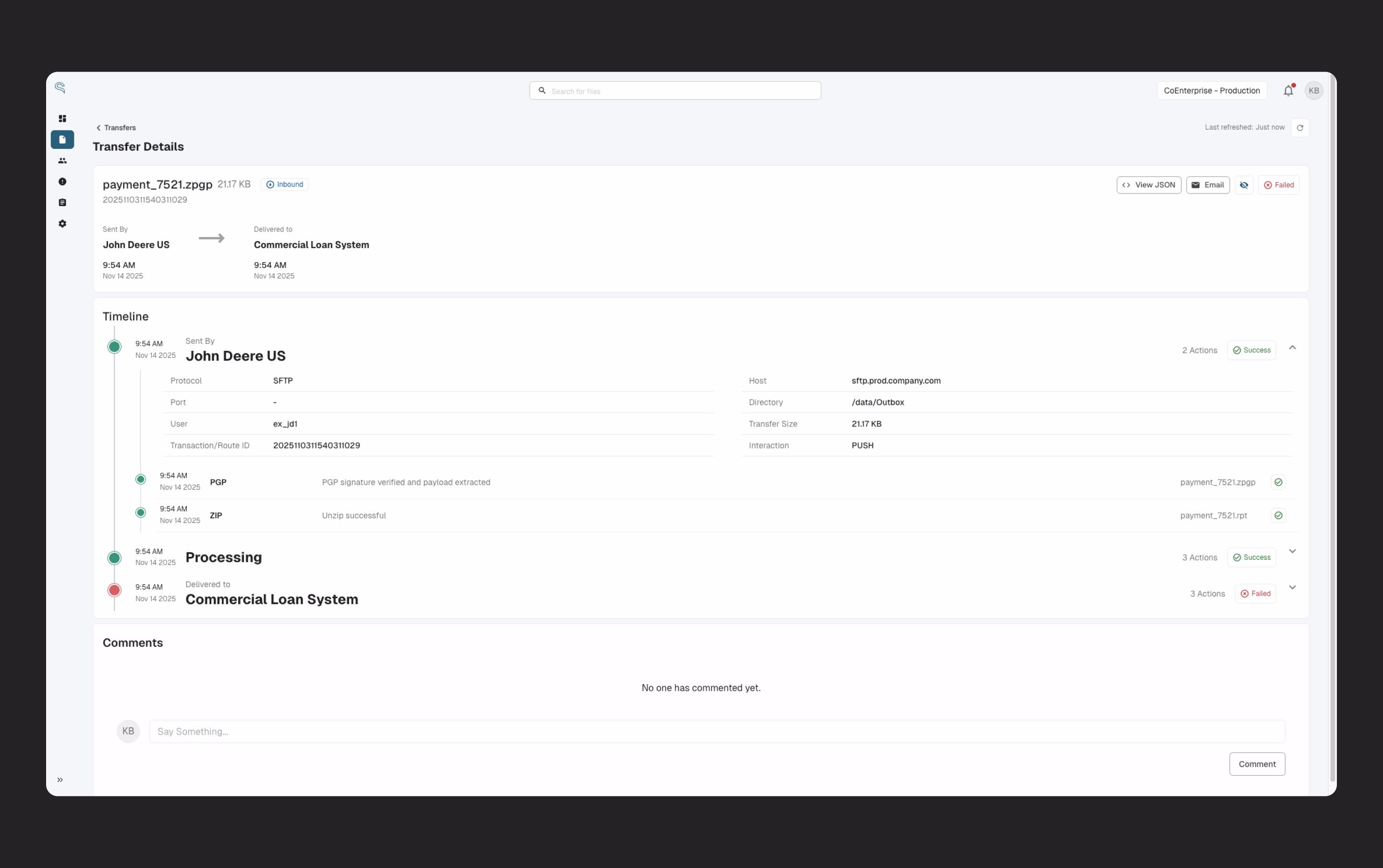
Making State Explicit
I introduced filter chips that surface active filters directly in the workspace. These act as visual breadcrumbs, preserving orientation and control. A "Clear All" affordance provides a fast return to baseline.
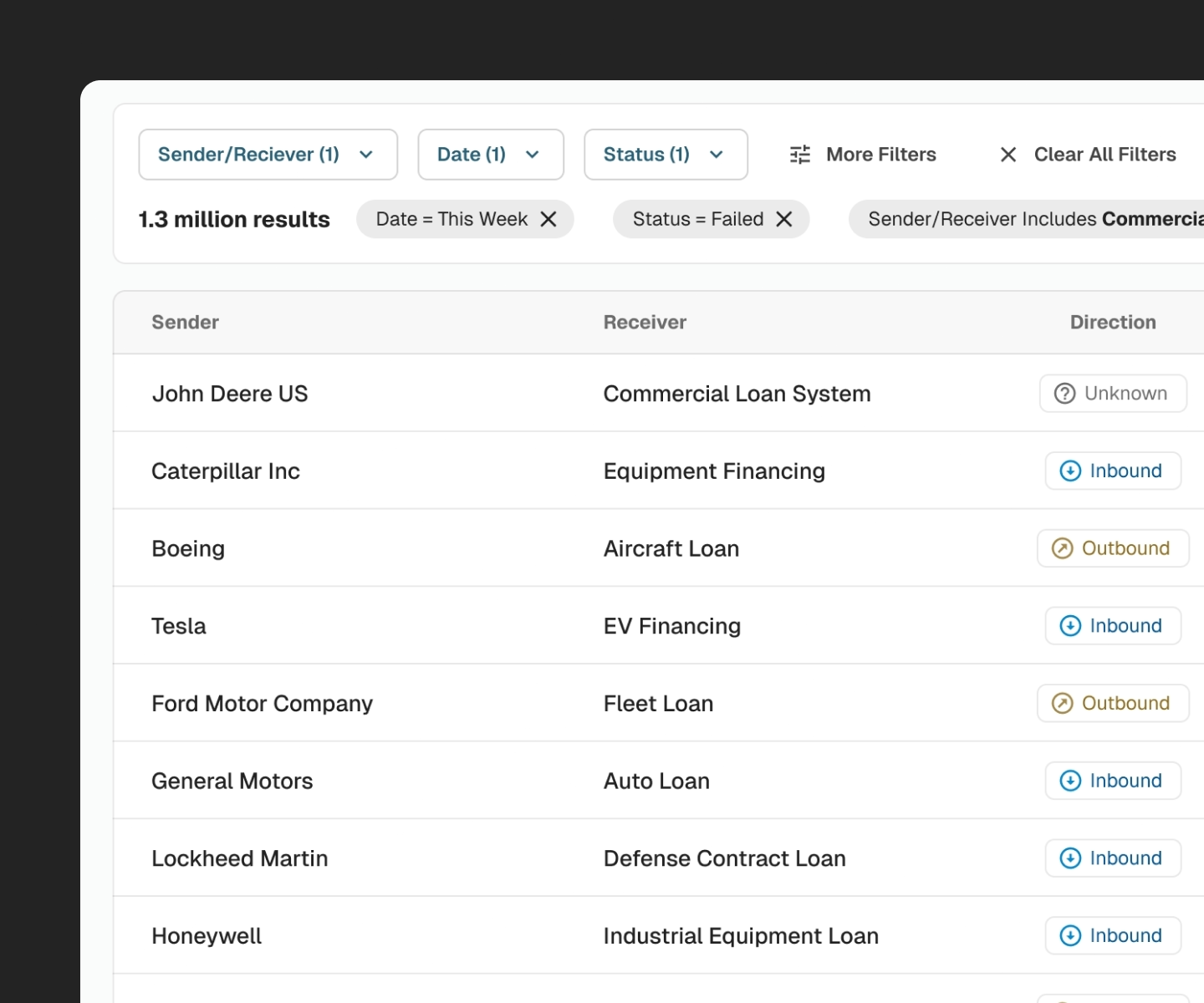
Filter chips surface active filters directly in the workspace
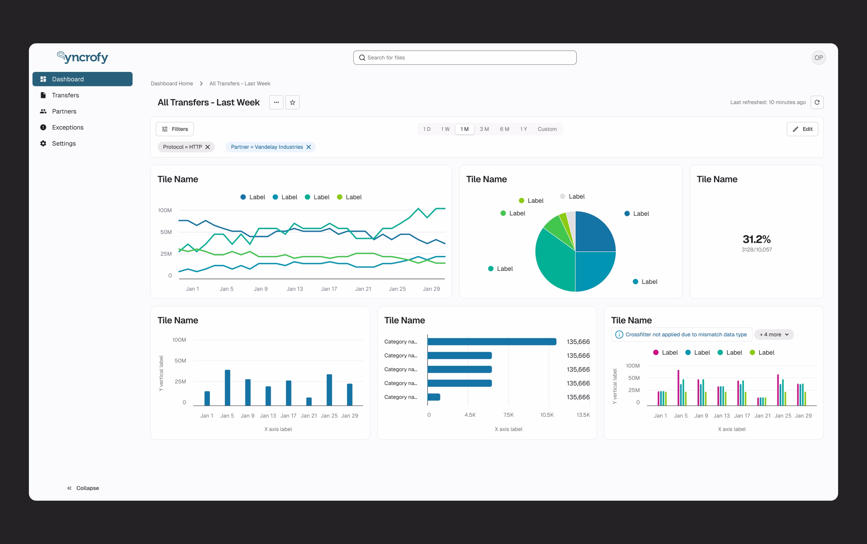
Establishing a Hierarchy of Truth for Dashboards
I redesigned dashboards to support explicit global filters, supported by a clear precedence model between global, tile-level, and temporary filters. This eliminated ambiguity and made dashboard state predictable and saveable.
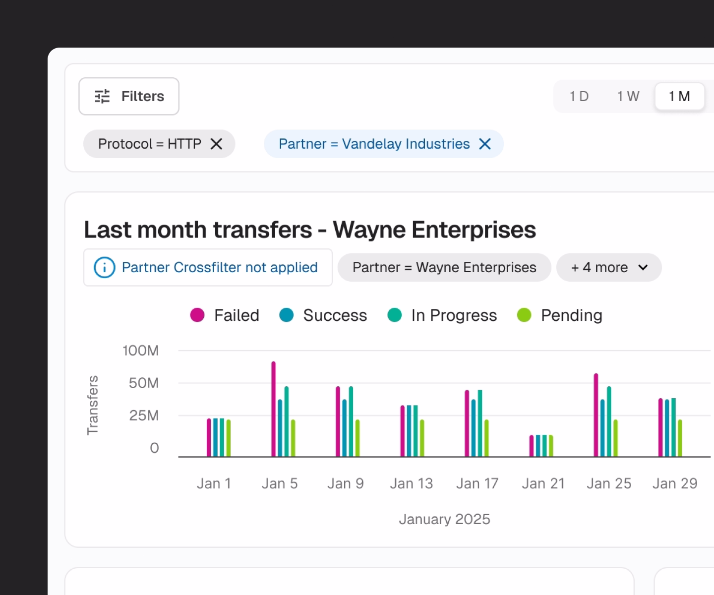
Dashboard global filters highlight when in conflict with local filters.
Outcomes
Reduced cognitive overload.
Default filtering focuses on the Top 8 use cases, cutting visible filter clutter by 84%.
Maintained enterprise flexibility.
All legacy filters remain accessible through progressive disclosure, meeting the 100% parity mandate.
Improved user orientation.
Filter chips and explicit state reduce confusion and improve trust in the data being shown.
Stabilized dashboard behavior.
A clear filtering hierarchy transformed dashboards into reliable operational tools rather than exploratory experiments.
The overall redesign showing the improved filter list.
Reflection
This project reinforced that enterprise design success often comes down to sequencing complexity, not eliminating it. When research and iteration are constrained, principled decisions grounded in usage data and system logic can dramatically reduce risk while setting a foundation for future validation.